About the Author: From Pioneering Design Education to Global Consulting
The Invisible Bond Between Color & Light and How a Bathroom Mirror Changed My Entire Career
The Restorative Blueprint: 3 Rules to Stop Guessing with Color and Light
Take It Further: Become a Certified Color & Lighting Consultant
Expert FAQ:
1. About the Author: From Pioneering Design Education to Global Consulting
Before diving into this article, you might wonder who I am. I am French, and my name is Myriam MARKIEWICZ. For nearly 15 years, I directed the very first design school in France to deliver a state-recognized certification for interior decorators and space design consultants, specifically tailored for adults undergoing career transitions.
After successfully selling my school to an investment fund, I decided to embark on a new international adventure: sharing my expertise in interior design with the US market and the rest of the world. My specialty? Home styling and interior design as well as the mastery of color and light applied to interior design. These always delivered with that distinct, sought-after French Touch.
To bring this vision to life, I founded Alna Design, an interior design course platform where you can already access free mini-courses on these vital topics, as well as our premier interior design certification program to become a certified Color & Lighting Consultant. This article is designed to give you your first real “enlightenment” on the subject.
2. The Invisible Bond Between Color & Light and How a Bathroom Mirror Changed My Entire Career
It was long before I became an interior designer or directed a design school. I was working as a personal shopper and image consultant. My job was about color theory; analyzing skin undertones, hair pigments, and eye colors to rebuild my clients’ confidence.
I never planned to transition into interior decoration. But life has a beautiful way of guiding us through unexpected turning points. It was one specific “happy accident”, that completely shattered my perspective and forced me to look at spaces differently.
I had one specific client whose transformation was an absolute success. Her husband even called me to say that her entire posture had changed. She was finally walking with her head held high. Yet, a few weeks later, she called me, deeply discouraged. Despite loving her new style, she confessed that she felt instantly unattractive every time she looked at herself in her bathroom mirror in the morning.
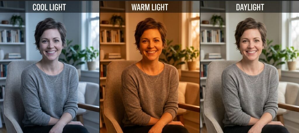
Intrigued and wanting to help, I offered to visit her home to figure out what was wrong. The moment I walked into her bathroom, the issue became blindingly obvious. The walls were covered in a specific blue-green tile; a shade that already drains the warmth out of human skin tones. To make matters worse, her vanity lights were fitted with harsh, ultra-white commercial bulbs. The combination was catastrophic: it created shadows and a sickly, pale cast that made her look completely exhausted first thing in the morning.
How three different Kelvin temperatures (from warm to cool light) drastically alter skin tone and facial shadows.
I wasn’t about to rip out her tiles, but I immediately swapped her cold bulbs for specialized daylight-balanced lamps with the correct color rendering. Instantly, her natural warmth returned in the reflection, and the problem was solved.
That precise moment changed everything for me. It was the spark that triggered my own career pivot into interior design.
I realized a profound truth that day: if a bad combination of light and color could completely distort a person’s confidence in her own home, it was doing the exact same thing to the walls, rooms, and sanctuaries we live in. Bad lighting doesn’t just ruin a paint swatch; it actively spikes anxiety and drains our emotional well-being. I needed to stop just dressing the person; I needed to dress the space around them.
Since that day, I have never looked back. This exact cross-disciplinary expertise, combining the strict rules of human color theory with advanced lighting dynamics—is why guesswork has no place in high-end interior decoration.
Here is how you can stop guessing, avoid these emotional catastrophes, and start designing scientificallyrestorative spaces.
3. The Restorative Blueprint: 3 Strategics Rules to Stop Guessing with Color and Light
1. Never Choose Paint Without Checking the CRI (Color Rendering Index)
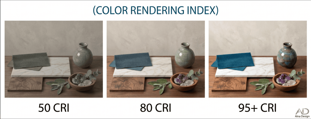
Most poeple think a color looks bad because they picked the wrong swatch. In some cases its true, but most often, it is because they chose the wrong Color Rendering Index (CRI). CRI is a scientific scale that measures how accurately a light source reveals the true pigments of an object compared to natural sunlight.
If your LED bulbs have a CRI lower than 90, they lack the full spectrum of red and warm wavelengths. Under these cheap, low-grade light sources, that beautiful, calming sage green or soft beige you carefully selected will lose its vitality and mutate into a cold, sterile gray. To design a truly healing space, always specify bulbs with a CRI of 90 or higher (CRI 95+ is the gold standard). This simple rule ensures that the healing pigments in your walls remain vibrant, deep, and soothing, exactly as you intended.
The science of seeing color: The same interior vignette viewed under 50 CRI (dull and flat), 80 CRI (standard), and 95+ CRI (full color accuracy). Infographic by Alna Design.
2. The Quick Rule of Thumb: 3 Key Rules for Light Temperatures
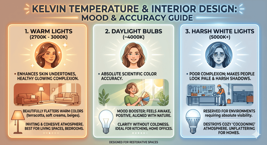
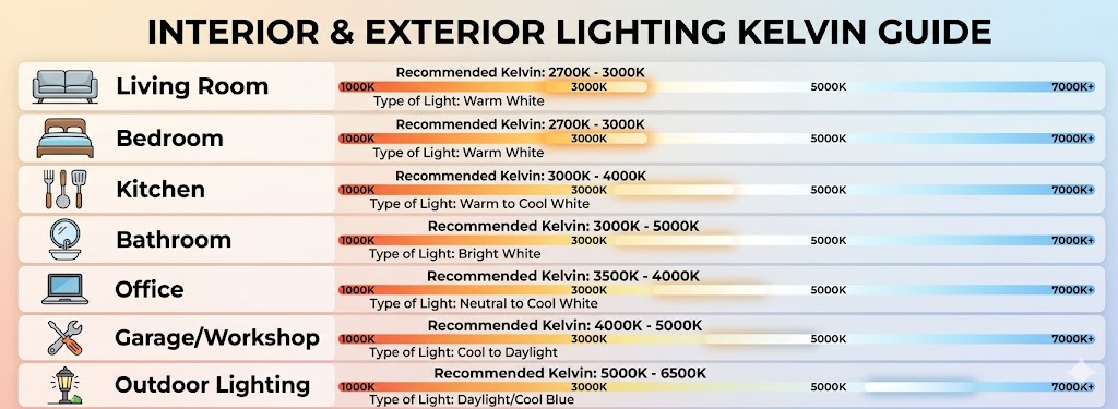
1. Warm Lights: flatter the Skin and Warm Pigments – As a general rule, warm lighting (2700K – 3000K) is your best ally for human spaces. It instantly enhances the skin’s natural undertones, creating a healthy, glowing complexion. Furthermore, it beautifully flatters warm paint colors, such as soft creams, rich beiges, or terracotta making the entire room feel instantly inviting and cohesive.
2. Daylight Bulbs: pure accuracy and mood boosters – Daylight-balanced bulbs (around 4000K) render colors with absolute, scientific accuracy. Because this temperature perfectly mimics natural outdoor sunlight, it is incredibly good for morale and mental well-being. It signals the brain to feel awake, positive, and aligned with nature, making it perfect for spaces where you need clarity without coldness.
3. Harsh White Lights: strictly for High-Precision Work – Ultra-white, cool lighting (5000K+) does not give a good complexion. It makes people look pale, creates harsh facial shadows, and completely destroys any chance of creating a cozy, “cocooning” atmosphere meant for relaxation. These clinical bulbs should be strictly reserved for specific, high-precision work environments like a garage workshop or a technical desk, where absolute visibility is required.
The emotional and aesthetic impact of different Kelvin light temperatures on skin tone and home atmosphereQuick-reference Kelvin guide for selecting the perfect light temperature across different areas of a home.
3. Decode Color Psychology to Heal and Restore the Mind
Colors speak directly to our subconscious mind, and their emotional impact changes entirely depending on the surrounding light. To help you understand the influence of color on mood and behavior, I recorded a short video on the true power of color psychology in interior design.
Watch the video below to discover how color psychology shapes human emotions:
4. Take It Further: Become a Certified Color & Lighting Consultant
Whether you are an interior design professional or a career changer looking to master new skills, this certification will empower you to design restorative interiors using the power of color psychology and lighting design.
Bringing a unique signature of French aesthetic excellence to the global stage, I developed the Color & Lighting Certification Program at Alna Design. This professional program, field-tested throughout my career, empowers you to stop guessing. You will learn how to avoid catastrophic lighting mistakes, select therapeutic and elegant color palettes with precision, and master the art of combining French flair with spaces that actively heal, comfort, and restore the human mind.
5. Expert FAQ: Demystifying Color Psychology and Lighting Dynamics
How do I prevent bathroom lighting from making my clients look exhausted?
Never use direct overhead recessed spotlights above a mirror. They cast aggressive shadows under the eyes and drain the face. Instead, place diffuse, vertical light fixtures on both sides of the mirror at eye level, using high-CRI bulbs (95+). This creates a balanced cross-illumination that removes harsh shadows and flatters the natural warmth of the skin.
What is the absolute best Kelvin temperature for a restorative bedroom?
For ultimate relaxation, the golden rule is 2200K to 2700K (Warm White). This temperature perfectly mimics the softening light of a setting sun. It signals your biological clock to slow down, encouraging a natural dip in blood pressure and preparing the mind for deep, restorative sleep.
Why does a perfect paint swatch look completely ruined once applied to the walls?
This is a classic case of metamerism, the phenomenon where a color completely shifts its character depending on the light source hitting its pigments. A soft beige can look warm under a store light, cold and sterile under a north-facing morning sky, and muddy under standard LEDs at night. Always test large painted boards in the actual room across different times of the day.
Can a bad combination of color and light actually trigger physical anxiety?
Yes, absolutely. Light and color are not just visual data; they are biological triggers. Harsh, blue-toned commercial lighting (above 5000K) at night blocks melatonin production and keeps the body in a constant state of alert. When bounced off clinical or poorly matched paint shades, it can create an unsettling, institution-like atmosphere that actively spikes daily stress and emotional exhaustion.
Who is the Alna Design Certification Program for, and what will I learn?
This premium certification is designed for both established interior design professionals looking to upgrade their technical authority and career changers wanting to master new, highly valuable professional skills. Unlike generic interior decoration courses, this color consultant certification program bridges the gap between the advanced, universal science of color and light and the elegance of French aesthetic sophistication. By the end of the certification, you will stop guessing and start creating elegant, functional, and scientifically restorative interiors with absolute confidence.
Myriam Markiewicz is a French interior designer who has made her mark with publications and by launching France’s first certification program in residential interior design for career changers.
To provide the best experiences, we use technologies like cookies to store and/or access device information. Consenting to these technologies will allow us to process data such as browsing behavior or unique IDs on this site. Not consenting or withdrawing consent, may adversely affect certain features and functions.
Functional
Always active
The technical storage or access is strictly necessary for the legitimate purpose of enabling the use of a specific service explicitly requested by the subscriber or user, or for the sole purpose of carrying out the transmission of a communication over an electronic communications network.
Preferences
The technical storage or access is necessary for the legitimate purpose of storing preferences that are not requested by the subscriber or user.
Statistics
The technical storage or access that is used exclusively for statistical purposes.The technical storage or access that is used exclusively for anonymous statistical purposes. Without a subpoena, voluntary compliance on the part of your Internet Service Provider, or additional records from a third party, information stored or retrieved for this purpose alone cannot usually be used to identify you.
Marketing
The technical storage or access is required to create user profiles to send advertising, or to track the user on a website or across several websites for similar marketing purposes.


More from the blog
How to Become an Interior Decorator: Self-Teaching vs. Certification
Read moreSep
What Is a Paint Color Consultant? (And How to Become One)
Read moreAug
Color Psychology & Lighting: How Interior Design Affects Mood
Read moreMay